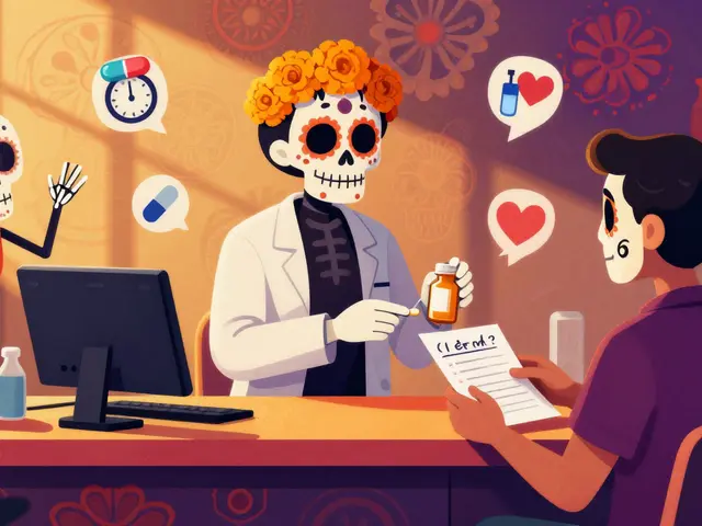
Why Visuals Matter for Generic Medications
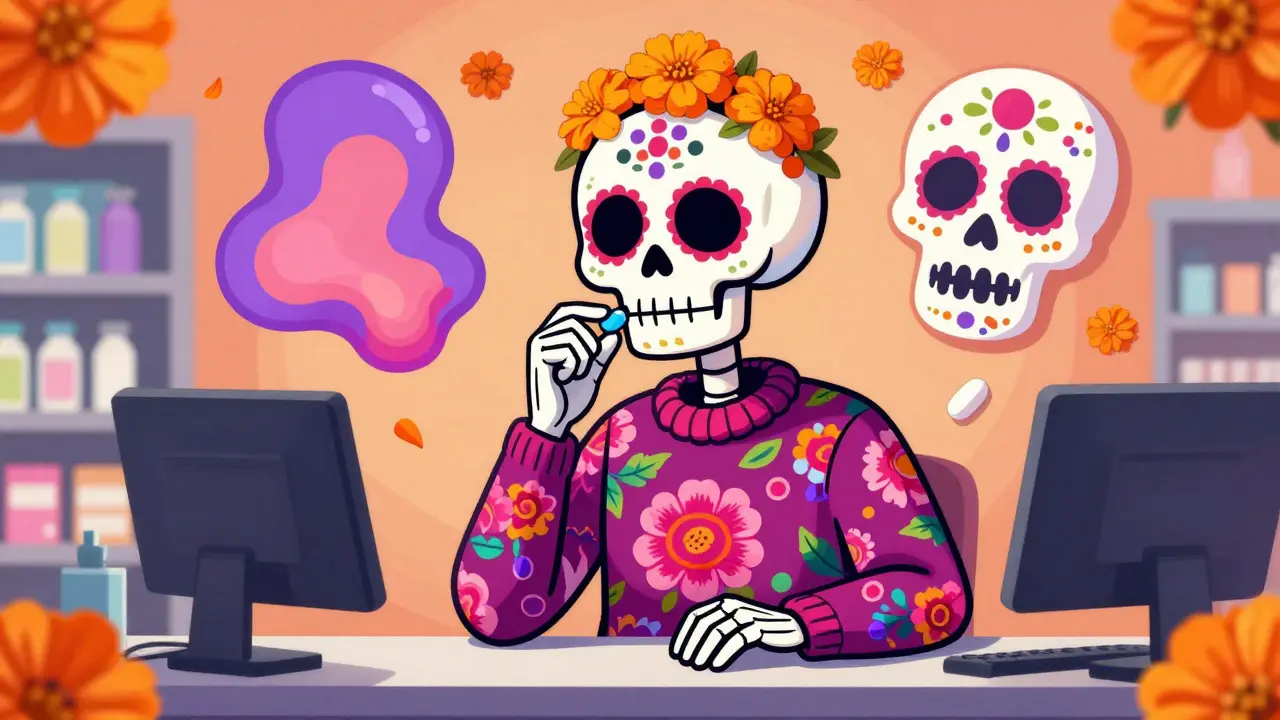
Have you ever walked out of a pharmacy with a different pill than the one your doctor prescribed and felt a moment of doubt? You are not alone. Many patients worry that a generic medication might not work as well as the brand-name version. This hesitation is common, but it often comes down to a lack of clear information. That is where infographics about generics come in. These visual education tools are designed to cut through the confusion and show exactly how generic drugs work.
Imagine trying to explain complex chemistry with just words. It gets messy fast. Now imagine a colorful chart showing two pills side by side, proving they contain the same active ingredients. That is the power of these tools. They turn dry regulatory science into something a patient can grasp in seconds. Since the early 2010s, these resources have become a standard part of patient education, especially after the U.S. Food and Drug Administration (FDA) ramped up its efforts in 2017.
By 2023, more than 90% of prescriptions filled in the United States were for generic drugs. Yet, a 2021 study found that 43% of patients still had concerns about their effectiveness. This gap between reality and perception is what these infographics aim to close. They are not just pictures; they are critical tools for saving money and maintaining health.
What Makes a Generic Drug Infographic Effective?
Not every picture helps. A good infographic about generic medications needs to hit specific points to be useful. First, it must address the core question: Are generics safe? The answer is yes, but patients need to see the proof. Effective visuals show the rigorous approval process required by the FDA.
These tools typically exist as downloadable PDF files. They are built to work on any device, from a smartphone in a waiting room to a printed handout on a doctor's desk. The technical standards are strict. For example, FDA infographics usually range from 142KB to 958KB in file size. They are printed at high resolution, often 300 DPI, to ensure text remains crisp even when enlarged. Many use CMYK color profiles so they look professional when printed by clinics.
Accessibility is another non-negotiable feature. A visual tool that cannot be read by a screen reader misses a huge part of the audience. High-quality infographics include alt text for screen readers and use high-contrast colors that meet WCAG 2.1 AA standards. They also keep language simple. The FDA targets an 8th-grade reading level for these materials. This ensures that complex medical terms do not block understanding.
The Science Behind the Visuals
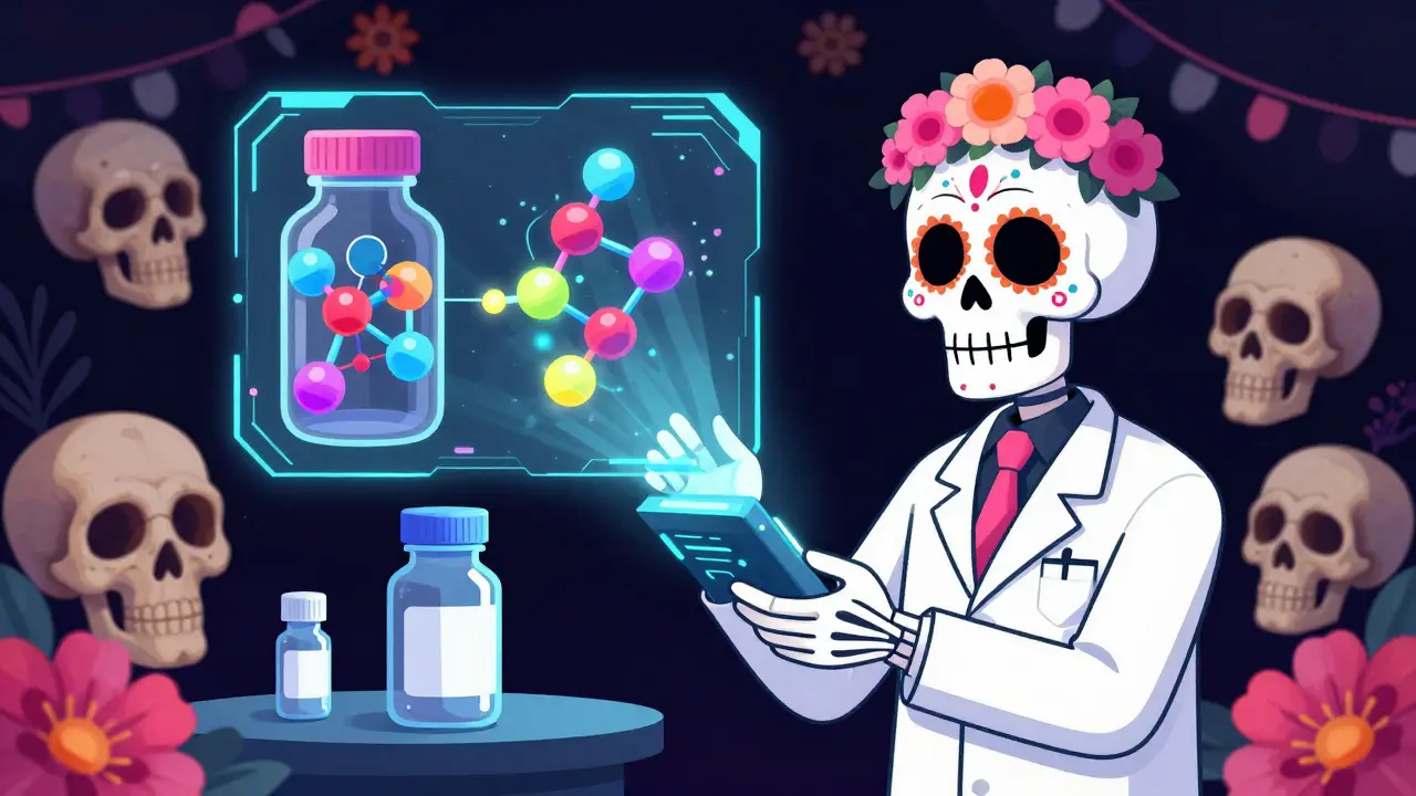
At the heart of these infographics is the concept of bioequivalence is the measure of how similar a generic drug is to the brand-name version in terms of absorption and effect. This is a tricky concept to explain verbally. A strong infographic will use comparative dissolution rate graphs. These charts show how quickly the drug releases into the body. In validation studies, 89% of test participants correctly interpreted these graphs when using FDA materials.
Another key element is the explanation of inactive ingredients. Patients often notice that generic pills look different in color or shape. This is because the fillers, or inactive ingredients, can vary. Infographics clarify that these differences do not change how the medicine works. They explain that the active ingredient must be identical. This distinction helps calm patients who worry that a different color means a different drug.
The regulatory framework is also visualized. The Generic Drug User Fee Amendments (GDUFA) set the rules for how these drugs are approved. Infographics often include timelines showing when a patent expires and when a generic can enter the market. This helps patients understand why some drugs have generics and others do not.

Who Creates These Education Tools?
Several organizations produce these materials, but they take different approaches. The FDA is the primary source for regulatory science visuals. Their materials focus heavily on equivalence standards and safety data. They offer 100% of their generic drug resources in Spanish, which is crucial for reaching diverse populations.
Other groups like the GTMRx Institute focus on comprehensive medication management. Their infographics often include interactive elements in digital versions. You can click on sections to see detailed evidence. However, they provide fewer materials in Spanish compared to the FDA.
BeMedWise offers a series called 'Your Medicine: Be Safe. Be Smart.' These integrate well with medication logs but cover generic drugs less comprehensively. They address generics in only 3 of their 15 core infographics. Each organization has strengths, but the FDA remains the gold standard for scientific accuracy.
| Provider | Focus Area | Accessibility | Interactive Features |
|---|---|---|---|
| FDA is the U.S. Food and Drug Administration responsible for regulating drug safety | Regulatory Science | 100% Spanish Available | Static PDFs |
| GTMRx Institute is a research organization focused on medication management | Medication Management | 30% Spanish Available | Clickable Digital Versions |
| BeMedWise is a patient education platform for medication safety | Medication Tracking | Mixed | Integrated Logs |
Real-World Impact on Healthcare Costs
The value of these tools goes beyond understanding. It is about money. Generic drugs saved the U.S. healthcare system $1.68 trillion over the decade from 2010 to 2019. When patients accept generics, their out-of-pocket costs drop significantly. Infographics play a role in this by increasing acceptance rates.
At Kaiser Permanente's Southern California region, pharmacists reported that using these visuals reduced patient refusal of generic substitutions by 63%. One pharmacist noted on a professional forum that keeping the 'What Makes a Generic the Same as a Brand-Name Drug?' infographic behind the counter cut counseling time in half. This efficiency allows pharmacists to spend more time on other critical tasks.
The Congressional Budget Office projects that continued education could increase generic utilization to 95% by 2028. This shift could save an additional $200 billion annually. Visual tools are not just educational; they are economic drivers that make healthcare more sustainable.
Limitations and Areas for Improvement
Despite their success, these infographics are not perfect. Some experts point out that they oversimplify complex pharmacokinetic considerations. For drugs with a narrow therapeutic index, like warfarin or levothyroxin, small variations matter. Current visuals might create a false sense of equivalence for these specific cases.
Health equity is another gap. A 2022 analysis found that most infographics underrepresent how generic medications reduce disparities for minority populations. Data shows that 34.7% of African American patients report higher concerns about generic quality compared to 22.1% of White patients. Only the FDA's specific 'Generic Drugs and Health Equity Handout' addresses this directly.
There is also a need for better visual indicators for drugs requiring pharmacist notification during substitution. The Institute for Safe Medication Practices recommended adding these markers in their 2023 report. Currently, the concept is covered in text but lacks a clear visual cue.
How to Use Infographics in Practice
Healthcare facilities have standardized ways to implement these tools. Most simply add links to patient portal education libraries. Others print physical copies for waiting rooms. The FDA's Generic Drugs Stakeholder Toolkit provides specific guidance, including sample social media posts. Clinics using the full toolkit increased patient generic medication acceptance by 22% within six months.
For patients, accessing these resources is easy. You can find them on the FDA website or through your pharmacy's patient portal. The average session duration for viewing these materials is about 3 minutes and 27 seconds. This short time commitment makes them practical for busy schedules.
Future developments look promising. The FDA integrated augmented reality features by 2024. Now, patients can scan medication bottles to view 3D molecular comparisons of brand and generic versions. This technology makes the learning experience even more engaging and interactive.
Frequently Asked Questions
Are generic drugs exactly the same as brand-name drugs?
Generic drugs must have the same active ingredients, strength, and route of administration as the brand-name drug. They are required to be bioequivalent, meaning they work the same way in the body. The only differences are usually in inactive ingredients like fillers or colors.
Where can I find FDA generic drug infographics?
You can download them directly from the FDA website. They are available as PDF files in both English and Spanish. Many pharmacies also print these out for patients to take home during consultations.
Why do generic pills look different from brand pills?
Generic pills often have different colors or shapes because of the inactive ingredients used in manufacturing. These differences do not affect how the medicine works. The active ingredient remains identical to the brand-name version.
Do infographics help patients accept generic medications?
Yes, studies show that patients who view these infographics are 3.2 times more likely to correctly identify key equivalence concepts. Clinics using these tools have seen a significant reduction in patient refusal of generic substitutions.
Are there any risks with relying on visual education tools?
While helpful, infographics can oversimplify complex issues. For narrow therapeutic index drugs, patients should still consult their pharmacist. Visuals are a starting point for conversation, not a replacement for professional medical advice.


15 Comments
James Moreau March 27, 2026
I have seen these infographics in waiting rooms before and they really do help clear up confusion. Patients often get nervous when the pill looks different from what they expect. The visual comparison of active ingredients makes the science much easier to digest. It is good to see that accessibility standards are being followed in these materials. The high contrast colors are important for those with vision issues. I appreciate that the reading level is kept low for better understanding. This kind of tool should be standard in every pharmacy chain. It reduces the time pharmacists spend explaining the same thing repeatedly. The data on cost savings is also quite compelling for the system. I think more clinics should print these out for patients to take home. It builds trust in the medication process significantly. Everyone benefits when the information is clear and concise.
Jesse Hall March 27, 2026
Seeing the stats on generic utilization is really encouraging :) The shift to 90% is huge for healthcare costs. Visual tools make such a big difference in patient acceptance. I hope more people realize that the color change does not mean a different drug. It is great that the FDA is pushing for these standards. We need more of this kind of transparency in medicine. The savings for patients are definitely worth the effort to educate them. Keep up the good work on spreading this info :)
Donna Fogelsong March 28, 2026
bioequivalence is key but they hide the real data regarding inactive fillers and how they affect absorption rates in different demographics the regulatory framework is a facade for corporate profit margins disguised as patient safety tools
Zola Parker March 28, 2026
That is a very dark perspective on the situation but you might have a point about the fillers. The philosophy of trust in institutions is always complicated in modern healthcare. We should question everything even if the data looks good on paper. It is better to be skeptical than to blindly accept the narrative. The visual tools might be too simplistic for complex cases though. We need deeper analysis beyond just the charts provided. :)
winnipeg whitegloves March 30, 2026
The vibrant charts really do cut through the noise of medical jargon effectively. It is like painting a picture of safety that everyone can see clearly. The comparison graphs make the absorption rates feel tangible rather than abstract. I love how they visualize the patent expiration timelines too. It helps patients understand the market dynamics without getting lost in legalese. The color coding for active versus inactive ingredients is brilliant design. These tools turn dry science into a story we can follow. It is a smart way to democratize medical knowledge for everyone. The accessibility features show real care for diverse needs. I wish more industries would adopt this kind of clear communication style.
peter vencken April 1, 2026
I work in pharmecy and see this daily. The bioequivalance data is crucial for trust. Patients often panic when the pill changes color. We need to explain the inactive fillers clearly. Visuals help bridge that gap effectively. I recall a patient refusing meds last week. She thought the generic was a placebo. Showing the chart changed her mind instantly. The FDA standards are quite rigorous actually. Many people assume cheap means low quality. That assumption drives up costs unnecessarily. Insurance companies push these tools for savings. It makes sense from a budget perspective too. We should distribute these in waiting rooms more. It saves everyone time in the long run.
Chris Crosson April 3, 2026
The reduction in refusal rates by 63% is a massive win for efficiency. Pharmacists can focus on more complex interactions when the basics are covered. It is important to maintain high standards for these educational materials. We cannot afford to have misinformation spread through visual aids. The 3 minute viewing time is perfect for busy schedules. Patients appreciate quick and clear answers to their concerns. This approach supports better adherence to medication regimens. I believe we should push for wider adoption in rural clinics. Access to these resources should not depend on location. Everyone deserves to understand their medication options fully.
Linda Foster April 3, 2026
It is indeed imperative that these tools adhere to strict accessibility guidelines. The inclusion of alt text ensures that visually impaired individuals are not excluded. High contrast colors are a fundamental requirement for professional medical literature. The reading level must remain appropriate for the general public. We must ensure that no patient feels alienated by complex terminology. The FDA standards provide a solid foundation for these expectations. Compliance with WCAG standards should be mandatory for all such documents. It is a matter of equity in healthcare delivery. Every patient deserves equal access to vital health information. The commitment to quality in these visuals is commendable.
Rama Rish April 4, 2026
This info is super useful for my family.
Kevin Siewe April 6, 2026
It is good to hear that you found the information helpful for your family. Understanding generics can reduce anxiety for many household members. I hope the visuals make the process less confusing for everyone. Sharing this knowledge helps build confidence in the pharmacy system. It is always better to have clarity when managing health. Please feel free to reach out if you need further guidance. The resources are there to support you whenever needed. We want to ensure everyone feels secure about their medications.
Chris Farley April 6, 2026
These tools are just another way to push corporate agendas on the public. The focus on cost savings ignores the potential risks of switching medications. Patients should have the right to choose brand names without guilt. The government is forcing generics down our throats for profit. We need to demand better transparency about the testing protocols. The visual aids are likely biased towards the generic manufacturers. Trust in the system is eroding with every new mandate. Americans deserve better than this watered down education. We should be skeptical of any official narrative on this topic. The real science is hidden behind these pretty pictures.
Darlene Gomez April 8, 2026
It is important to acknowledge the frustration some people feel about medication choices. However, the data shows that generics are safe and effective for the vast majority. The goal is to make healthcare sustainable for everyone in the long term. We must balance individual preference with collective health needs. The infographics aim to inform rather than coerce patients into decisions. Open dialogue is the best way to address these concerns respectfully. Understanding the science can help alleviate fears about safety. We should all strive for a system that works for the community. Trust is built through clear and honest communication. Let us focus on the benefits for public health overall.
Katie Putbrese April 9, 2026
The lack of focus on minority populations in these materials is unacceptable. Health equity must be a priority in all educational outreach. We cannot ignore the disparities that exist in generic drug acceptance. The data on African American concerns needs more attention. It is a moral failing to overlook these specific community needs. The FDA must do more to address these gaps directly. Visual tools should reflect the diversity of the patient population. We need to see ourselves in the materials provided. This is a critical step towards true healthcare justice. Ignoring these issues perpetuates existing inequalities in the system.
Jacob Hessler April 10, 2026
its gona save money but i dont trust it. the govt always lies about these things. i want my real meds not the cheap stuff. they make us sick with generics.
Amber Gray April 11, 2026
totally agree with that 👍 but we need facts not fear. the studies show they work same. keep pushing for change 💪